8 Quick and Easy Ways To Add Movement to Your Squarespace Website
Your website is your calling card, and adding some subtle movement is a great way to take it from “meh” to “oh yeah!”
Well planned out animation can give your site that extra little “somethin’-somethin’” that can keep your page from looking like a stock template.
Here are 8 quick and easy ways to add movement to your Squarespace site.
Turn on Parallax
Parallax is a great built-in feature on Brine family in Squarespace 7.0. When you add the parallax effect to your website, it appears as if the content of a page/section moves independently over the background image. Using this effect can work well with simple sections like a newsletter sign up. I recommend that you don’t use this feature on more complex pages because it can wind up competing with your content.
Parallax is not a built-in feature of Squarespace 7.1 templates (yet). So if you are building in 7.1 and want to add this, try out this tutorial from Schwartz-Edmisten Design.
Use the built-in animation on image blocks
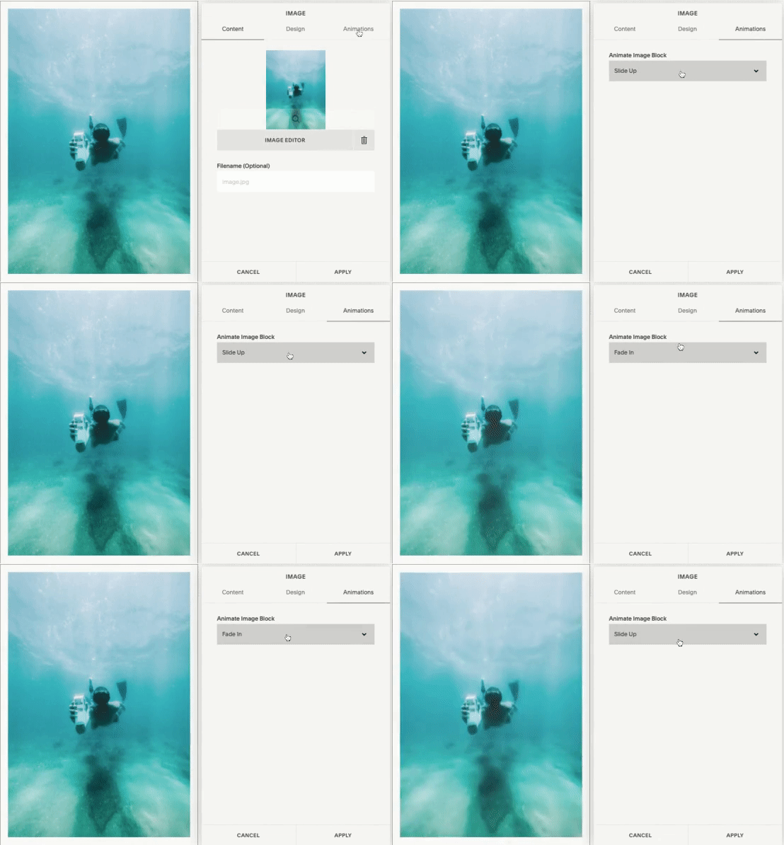
Last year Squarespace added an animation function to all of their image blocks…woohoo! You can access all of these options by simply choosing the animation tab on the image block settings.
Pro-Tip: Use this feature sparingly. Adding too much image animation can be distracting to the eye. So I wouldn’t use it more than once per page.
Add a GIF to your Website
GIFs can be a fun and easy way to inject a little personality into your website. They are great for blog posts. And did you know you can even use a GIF as a background image on an index page?
Use a little CSS to Create Some Button Animation
Custom CSS doesn’t have to be intimidating. With Squarespace, fun CSS customization can be as simple as copy and pasting some code into the custom CSS section of the Design tab.
Here are links to a couple of my fave free button over animation codes.
Move Over Button Animation from Ghost Plugins.
Change Button Cover on Hover from Thirty-Eight Visuals.
Underline Button on Hover from Inside The Square.
Add a Full Page Pop-Up
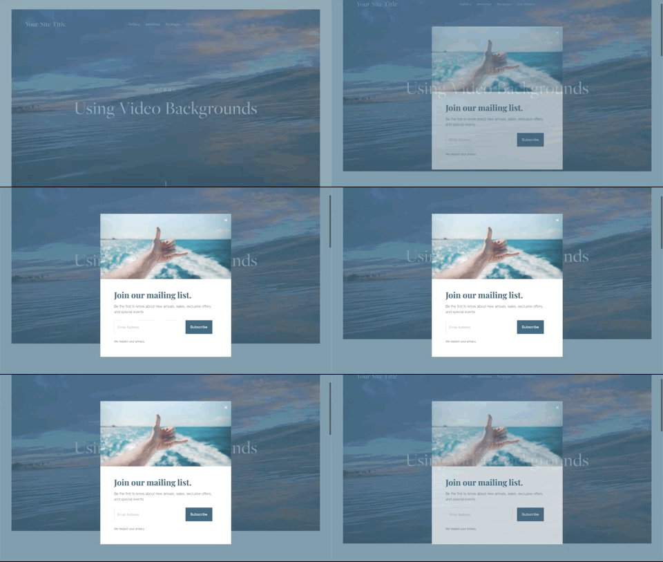
I know. I know. Pop-ups can be annoying. BUT when done right and when they include useful information that your visitors want, they can be a fantastic way to highlight essential info or a promotion on your site.
Squarespace has some lovely pup-up templates to choose from that you can customize for your needs. To access them, just go to Marketing>Promotional Pop-Up.
Add a Video Background
Adding a video background to an index page is a piece of cake. Simply go click on BANNER and then the video tab. Adding the video is as simple as copy and pasting a link to the Vimeo, YouTube, or Wistia video you like.
Pro-tip #1: If you have access to the original video file, I suggest uploading it to Vimeo or Wistia to avoid having the YouTube suggested videos pop up on your website.
Pro-tip #2: When using videos either as background images or embedded somewhere on your site, be sure to add the Mobile Fallback Image. Your video may not show on mobile devices. Adding a fallback image will ensure that you can control what the design will look like on mobile phones.
Create a Full-Width Gallery Slider
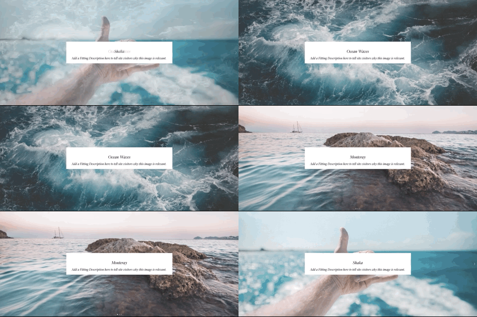
This is another useful built-in feature of Squarespace that allows you to display content in a more interesting and dynamic way. I often use this feature as a way to add some visual interest to a monochrome site.
To create this feature, simply add a Gallery page to an index. Add photos and text to each image and stylize your slider in the style editor.
Turn a Boring Static Image into a Mini Gallery
Sure static images are fine. Actually, they are pretty necessary for most websites. But that doesn’t mean you can add a little more interest by using a Gallery block to add some movement.
To recreate the effect below, add a gallery block and choose the slideshow option on the Design tab. Once you’ve done that, tick the “Automatically Transition Between Slides” box and set the animation’s timing using the slider.
Need help writing the perfect tagline for your website?
Click below to get my free guide,
“3 Steps to Writing a Money-Making Tagline”


